Google Search Box Redesign Explained
Google rarely touches the core shape of Search. That is why the Google search box redesign deserves more attention than a simple UI tweak. If you use Google every day, this change affects where your eyes land, what you click first, and how quickly Google can steer you toward AI answers, ads, and follow-up prompts. Small interface moves often carry big business intent. Search is no exception.
I have covered search product changes for years, and this one stands out because Google has kept the basic search box nearly frozen for about 25 years. You do not change a habit this old unless the stakes are high. Look at it closely and the message is plain. Google wants Search to feel less like a blank field and more like a guided system, one that keeps you inside Google’s own flow as AI competition tightens.
What stands out right away
- The search box is no longer sacred. Google is willing to alter one of the most familiar elements on the web.
- This is about behavior, not decoration. The design nudges how you search and what you click next.
- AI pressure is part of the story. Search now has to compete with ChatGPT, Perplexity, and other answer-first tools.
- Ads and engagement matter. Any shift in the first screen of Search can affect revenue and user retention.
Why the Google search box redesign matters
Google’s homepage has long worked like a clean front desk. One box. Very little noise. Type your query and move on. That simplicity helped turn Search into muscle memory for billions of people.
But habits can age out. And Google knows it. Search is under pressure from AI chatbots that do not ask users to think in keywords first. They invite full questions, follow-ups, and back-and-forth conversation. So what does Google do? It starts reshaping the entry point.
This is a strategic product signal.
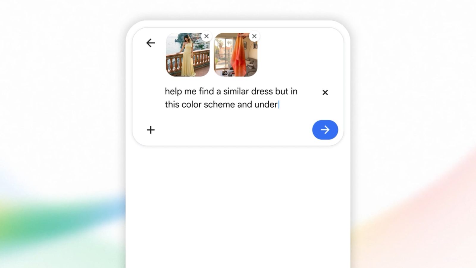
A redesigned search box can help Google push users toward longer queries, voice input, visual search, or AI-generated summaries. Even if the visual change looks modest, the intent is larger. It is like moving the stove, sink, and prep space in a kitchen. Same room, different workflow.
Google is not redesigning the front door because it is bored. It is doing it because the way people seek answers is changing fast.
How the Google search box redesign fits the AI search race
Search no longer competes only with Bing or DuckDuckGo. Now it also competes with ChatGPT, Perplexity, Claude, and every assistant baked into phones and browsers. That changes the bar. Users expect direct answers, context, and quick refinement.
The old search box was built for a web of links. The newer search environment is built for intent prediction. That is a different product logic entirely.
What Google is likely trying to encourage
- Longer, more natural queries
- More interaction with AI Overviews and related prompts
- Greater use of multimodal search, including voice and image input
- More follow-on searches without leaving the Google ecosystem
Honestly, this was probably unavoidable. Once users get comfortable asking a chatbot, “What laptop should I buy for video editing under $1,500?” it becomes harder to pull them back to the old keyword box unless Search feels just as intuitive.
What this means for users
For most people, the immediate effect will feel subtle. You may not even notice the design change on day one. But over time, small shifts in layout and emphasis can reshape your behavior. That is the point.
Expect Google to keep reducing friction around richer queries. You may see stronger visual cues for asking full questions, using voice, or continuing a search session across multiple steps. Why does that matter? Because the interface starts deciding which type of search feels “normal.”
And that has consequences.
If Google pushes users toward AI summaries before links, publishers get less direct traffic. If it pushes commercial prompts higher, shoppers may be steered faster into monetized results. If it keeps users inside interactive answer layers, the open web loses another slice of attention.
What this means for publishers, marketers, and SEO teams
If your business depends on search visibility, you should treat the Google search box redesign as an early warning. Not a panic moment. But a signal.
Search optimization is no longer only about ranking for blue links. It now includes visibility inside AI Overviews, featured modules, conversational refinements, product carousels, and related query paths. The first input field shapes all of that downstream behavior.
Practical moves to make now
- Review pages that answer clear user questions in plain language
- Strengthen entity signals, author trust, and source transparency
- Format content so Google can extract direct answers cleanly
- Watch changes in click-through rate, not just ranking position
- Track whether traffic shifts from traditional search results to zero-click experiences
Here’s the thing. A prettier or smarter entry box is not neutral for SEO. It can change query length, query type, and user expectations almost overnight.
Why Google waited this long
Because the old design still worked. Google does not casually tamper with one of the most recognized interfaces in tech. That box is part product, part brand asset, part money printer.
So why move now? Two reasons look obvious.
First, AI has made plain search feel old in places. Second, regulators, competitors, and changing user habits are forcing Google to prove Search can still evolve. A redesign helps send that message without blowing up the whole product.
But I would push back on any claim that this is merely cosmetic. Companies do not revisit sacred UI elements after decades unless larger behavior shifts are in play (and unless internal metrics say the risk is worth it).
The bigger business story behind the interface
Google Search is still tied tightly to ad revenue. Any change to the top of the funnel matters because it can influence how often users search, how they refine queries, and what results earn clicks. That makes the search box one of the most valuable input fields on earth.
Think of it like a football coach changing the first play after years of using the same opener. Fans may see one formation. The staff sees a different game plan.
The redesign also gives Google room to blend classic search with generative AI more smoothly. Instead of asking users to choose between “search” and “chat,” Google can slowly merge the two behaviors. That is smart product strategy, even if some users will hate the extra hand-holding.
What to watch next
The search box itself is only step one. The real story is what Google layers around it over the next year.
- More prompts for conversational follow-ups
- Stronger placement of AI-generated summaries
- More visual search and voice search options
- Further changes to homepage and results page hierarchy
- New ad formats built around AI-assisted search behavior
Watch user behavior data if it becomes available from Google, browser analysts, or firms like Similarweb and Statcounter. The key question is simple. Does this redesign lead people to search differently, or just look at a different box?
The next signal will be even louder
The Google search box redesign is a small visual change with a much bigger agenda. It shows Google is willing to rethink the oldest habit in Search because AI tools have changed what users expect from an answer engine. That should get your attention.
If this redesign works, Google will keep moving Search away from a passive blank field and toward an active guide. If it does not, users may keep drifting to tools that feel more direct. Either way, the era of the untouched search box is over. What else is Google willing to rewrite next?