Microsoft 365 Copilot Redesign Explained
If you use Microsoft apps for work, the Microsoft 365 Copilot redesign matters for a simple reason. Microsoft is trying to turn Copilot from a side feature into the front door for Word, Excel, Teams, and your company files. That shift affects how you search, how you start tasks, and how much of your workday runs through AI. It also lands at a tense moment, because plenty of office workers still do not know where Copilot fits, or whether it actually saves time. Microsoft seems to understand that problem. The new design aims to make Copilot feel less scattered and more central, with a cleaner home page, stronger search behavior, and more visible ways to reach content and agents. But does a cleaner layout fix the deeper issue of usefulness? That is the real question.
What stands out in the Microsoft 365 Copilot redesign
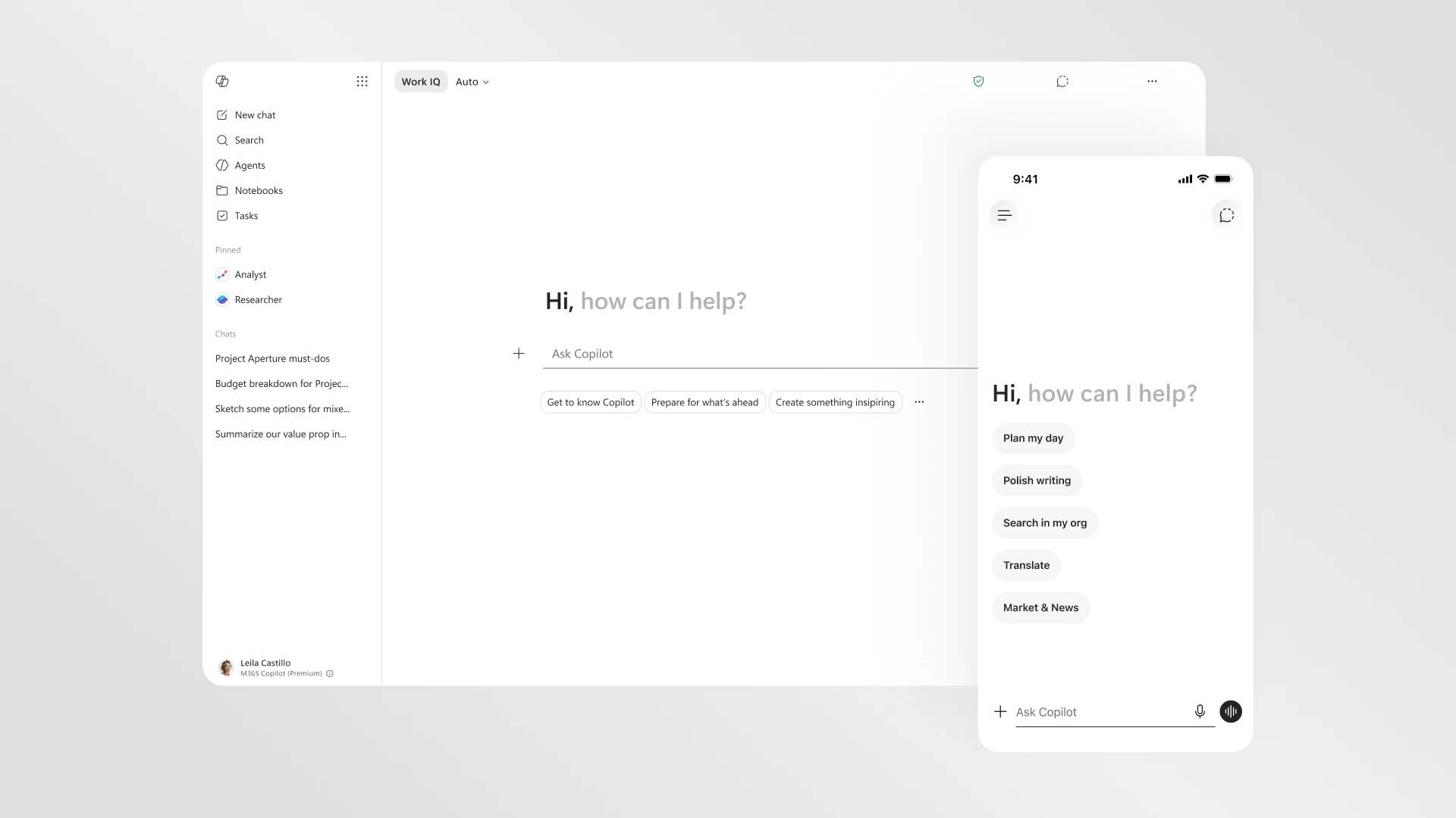
- Copilot is moving toward a hub model, where search, chat, notebooks, and agents sit closer together.
- Microsoft wants simpler entry points, so users can start work from one screen instead of bouncing across apps.
- The redesign mirrors a larger strategy, with AI becoming the shell around Microsoft 365 rather than a tucked-away add-on.
- Usability is the make-or-break issue, because a new interface alone will not convince skeptical workers.
Why Microsoft is redesigning Microsoft 365 Copilot
Look, the old problem was obvious. Microsoft had AI in many places, but the experience could feel fragmented. You had Copilot in Windows, Copilot in Bing, Copilot in Word, Copilot in Teams, and then separate spaces for files, search, and workflow tools. For normal users, that is friction.
The redesign looks like Microsoft admitting that AI tools need a clearer center of gravity. If users have to guess where to click, they will fall back to old habits. Email. Folders. Search bars. Manual work.
That is why this update matters beyond cosmetics. Microsoft wants Copilot to become the operating layer for work. Think of it like a kitchen remodel. If the stove, sink, and fridge sit too far apart, cooking feels clumsy even if each appliance is good on its own.
Microsoft is not just polishing a product page. It is trying to train users to begin work inside Copilot.
What changed in the Microsoft 365 Copilot redesign
A cleaner home page
Based on reporting from The Verge, Microsoft has reworked the app with a new landing experience that pulls together chat, search, notebooks, and agents in a more unified layout. The goal is simple. Reduce clutter, surface useful actions faster, and make the app feel like a starting point.
That sounds modest, but software habits are built on small interface choices. A prominent prompt box or a better file panel can change how often people use a tool.
Search and content get a bigger role
One notable shift is the stronger emphasis on finding information across your work environment. That includes documents, meeting context, and internal data tied to Microsoft Graph. For enterprise users, this is where Copilot either proves itself or fails.
Most people do not need AI to write a poem in Excel. They need it to find the deck their boss mentioned last Tuesday, pull key points from a Teams meeting, and draft a summary that is close enough to edit quickly.
Agents and notebooks move closer to everyday work
Microsoft is also leaning harder into agents and notebooks. In plain terms, that means more support for AI helpers that can carry out specific tasks, plus spaces where information and prompts can stay organized over time. This is a smart move, because one-off chat is only part of office work. Repeated tasks matter more.
And repeated tasks are where AI has a shot at earning its keep.
What the redesign says about Microsoft’s AI strategy
This update is not happening in isolation. Microsoft is in a race with Google Workspace, OpenAI’s enterprise push, Slack, Zoom, and a pile of startup tools that all want to own AI at work. So the company has a strategic problem as much as a design problem.
If Copilot feels optional, it loses. If it feels embedded in the flow of work, Microsoft has an edge because Word, Excel, Outlook, PowerPoint, and Teams already sit inside many companies.
Honestly, this is the strongest part of Microsoft’s position. Distribution beats novelty more often than people admit. Plenty of workers will use the AI tool that is already wired into their documents, meetings, and permissions system, even if a rival chatbot feels sharper in isolated tests.
- Own the starting screen for work.
- Connect AI to files, chats, calendars, and meetings.
- Make specialized agents easier to deploy.
- Turn Microsoft 365 into an AI workflow shell, not a bundle of separate apps.
Will the Microsoft 365 Copilot redesign actually help users?
Maybe, but only if the answers get better and the workflow gets faster.
That is the catch with every AI redesign. Cleaner navigation helps. Better layout helps. But office workers judge these tools by one brutal standard. Did it save me time today?
For many companies, the value test will come down to a few things:
- How reliably Copilot finds the right internal files
- Whether meeting summaries and document drafts need heavy cleanup
- How easy it is to move from chat to action inside Microsoft 365 apps
- Whether admins can control data access and compliance settings without a mess
If those pieces improve, the redesign could matter a lot. If not, this becomes another interface refresh that looks good in demos and fades in real use.
What business users should watch next
If you manage IT, operations, or knowledge work teams, watch adoption patterns instead of marketing claims. The smart question is not whether Copilot can do more things. It is whether your staff can do common tasks with fewer steps.
Pay attention to these signals over the next few months:
1. Starting behavior
Do workers begin inside Copilot more often, or do they still open Outlook, Teams, or SharePoint first? That will show whether the hub model is sticking.
2. Search quality
Can Copilot retrieve the right document, person, or meeting insight with less hunting? Enterprise AI lives or dies on retrieval.
3. Agent usefulness
Are agents solving narrow, repeatable business tasks, or are they mostly demo material? There is a big difference.
4. Trust and governance
Microsoft has to prove that AI convenience does not create new headaches around permissions, data exposure, and policy controls. In regulated industries, that piece is non-negotiable.
My read on the redesign
I have covered enough platform shifts to know when a company is cleaning up a product, and when it is trying to change user behavior. This feels like the second case. Microsoft wants Copilot to be the place where work begins, not the thing you occasionally click when you remember it exists.
That ambition makes sense. But the market is less patient now. Early AI novelty is fading, and buyers want proof. They want fewer clicks, faster retrieval, cleaner drafting, and tighter integration with the systems they already pay for.
The redesign gives Microsoft a better shot at that outcome (and frankly, it needed one). Still, interface polish is the easy part. The harder part is making Copilot useful enough that people miss it when it is gone.
What happens next
The Microsoft 365 Copilot redesign is a sign that Microsoft knows AI at work cannot stay scattered. It needs one visible center, one clear workflow, and one reason for workers to return every day. This update pushes in that direction.
But software history is full of elegant dashboards that never changed behavior. If Microsoft wants Copilot to become the default work layer, it has to make the product feel less like a feature and more like a competent colleague. We will see soon enough whether users agree, or whether they keep going back to the old tabs.